
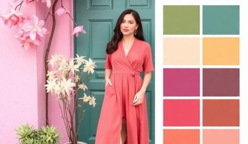

Remember when spring wardrobes meant playing it safe with a predictable pastel palette? Well, 2026 has arrived with a different philosophy: “Why not both?”
This season’s color story isn’t about choosing between bold and soft – it’s about embracing the delicious tension between them. According to the Spring/Summer 2026 runways, we’re witnessing what the Pantone Color Institute describes as a “mind-bending” approach to color – one that blends the “balanced and bold for a mind-bending future”.
So, if you’re wondering why that neon pink dress suddenly feels essential, or why everyone’s painting their walls soft teal, you’re not alone. The 2026 spring colors are as complex and multifaceted as the world we’re living in. They bring us both rebellious energy and calm, quiet reflection – often in the same outfit or room.
Table of Contents
ToggleThe Psychology Behind the Palette: Why These Colors Now
The color trends for Spring 2026 aren’t random selections from a designer’s mood board. They reflect a collective psychological need. Designers and color authorities like WGSN, Pantone, and Dulux have identified a palette that speaks to our current moment: a society “rediscovering the value of quiet reflection” while simultaneously yearning for joyful self-expression.
As interior designer Corey Damen Jenkins puts it, “After years of interiors drenched in neutral tones, people are hungry for color that feels alive and joyful, without being aggressive. Both teal and pistachio carry something restorative and grounding—they invite you in rather than shout at you”.
This dual craving for calm and energy defines the season. In fashion terms, that might look like a clashing, high-impact outfit, or the simple, serene elegance of a white dress. In interior design, you can balance energizing accents with calming, natural backdrops.
The 2026 Spring Fashion Color Trends: What You Need to Wear
This year’s fashion color story is about two distinct camps that are both decidedly NOT boring:
1. The Bold & The Beautiful
Spring 2026 isn’t scared of the spotlight. The runways, from Versace to Loewe, made a strong case for high-impact color. Who What Wear spotted a key “clashing-color trend,” where designers paired unlikely shades like cobalt and violet for a look that’s impossible to ignore. We saw this show up in the collections of Versace and Loewe, and it’s quickly influencing more wearable, everyday styles.
-
Violet: Is violet the new burgundy? There’s a strong case for this, especially after seeing it across collections from Valentino and Chloé. It’s a jewel tone that works as a neutral, pairing seamlessly with black, camel, or even more violet.
-
Cobalt Blue: Another jewel-tone making a big splash is cobalt. It appeared on runways from designers like Loewe and Victoria Beckham. This shade of blue is “eye-popping” yet surprisingly “grounded,” as Vogue noted, especially when tempered by opaque black tights or a white wool skirt.
-
Fuchsia and Flamingo Pink: Pink is back, but louder than ever. At Alaïa, fuchsia appeared as “hot pink” in asymmetric pleated skirts, while at Chloé, it was balanced by sensible khaki skirts. Fashion experts are calling it “unmissable”. Think of it as the “Barbiecore” evolution but with more range.
-
Citrus Yellow & Lime: From Prada to Bottega Veneta, citrus hues are cutting through the clutter. Prada’s collection featured a show-stopping dress in a shade “somewhere between lime and chartreuse”. This isn’t a color for the shy, but when paired with black or neutral tones, it creates an incredibly modern, confident statement.
2. The Calm & The Collected
On the opposite end of the spectrum, the season’s biggest “color” might just be… white. Pantone’s Color of the Year for 2026 is “Cloud Dancer,” described as “a lofty white that serves as a symbol of calming influence in a society rediscovering the value of quiet reflection”. At Balenciaga, Pierpaolo Piccioli proved that “a vanilla shade can be anything but boring,” while Bottega Veneta also showcased garments close to Cloud Dancer.
-
Antique White & Creamy Neutrals: “Antique white” offers depth and a cozy, warm feeling, providing the perfect foundation for other trends. Think of it as a timeless, “stealth-wealth” alternative to the “boring” neutrals of seasons past.
-
Soft Emerald & Pistachio Green: Green is having its moment, but it’s the softer side that’s winning hearts. “Soft emerald” is described as earthy, sitting between khaki and green and working perfectly for workwear. Meanwhile, interior designers are going wild for pistachio green, a shade that brings a “breezy, coastal influence” without being too heavy. It is fresh, clean, and infinitely calming.
Spring Colors in the Home: Palettes for 2026
The trends from the runway are flowing directly into interior design, creating homes that feel both fresh and personal.
The Rise of Teal and Pistachio
According to designers at Good Housekeeping, teal and pistachio are the colors to watch in home décor. Teal, especially in a bathroom or bedroom, creates a “spa-like” feel, “naturally mak[ing] the mind think of water, so it feels clean and refreshing”.
Pistachio, on the other hand, is recommended for sunlit rooms, guest rooms, or home offices. It “invite[s] that sense of creative or welcoming energy that will be easy on the eyes and not cause overstimulation over long periods of time”.
The Foundation: Earthy Pastels and Canvas Beige
Beyond the statement shades, a foundation of earthy pastels is underpinning many 2026 spring interiors. Colors like soft lavender, mint, blush pink, and baby blue are being balanced with grounding neutrals like Canvas Beige, which Pantone predicts “signifies our desire for a fresh start”.
How to Use These Colors
The pros suggest a few simple ways to work these shades into your home:
-
Pick the Right Room: Use teal in spaces where you want calm (bathrooms, bedrooms) and pistachio in spaces where you want energy (home offices, hallways, sunrooms).
-
Start with Accents: If you’re “color-curious,” Jenkins suggests starting with accessories—a rug, artwork, or pillows against neutral furnishings.
-
Create Contrast: Pair teal with warm metallic touches like gold or copper, and balance it with tangerine or butter yellow. Pistachio loves ivory, warm taupe, soft blush, and antique gold.
-
Pair with Natural Materials: Ground both colors with natural materials like linen, grasscloth, rattan, and warm wood.
A Practical How-to: Integrating Spring 2026 Colors into Your Life
Okay, so you’re convinced the colors are beautiful, but how do you actually use them? Here are some concrete steps you can take.
1st Step: Start with the “New Neutrals”
If you’re nervous about color, start by swapping out your standard black, navy, and beige for the season’s “new neutrals”:
-
For Fashion: Invest in a key piece in Antique White, Canvas Beige, or Soft Emerald. These are versatile enough to mix with your existing wardrobe but feel far more modern than pure white or khaki.
-
For Your Home: Repaint a room, or even just one wall, in Pistachio Green or Mint Blue. These shades feel fresh but won’t overwhelm you. Then, introduce your bold accents.
2nd Step: Add Energy with Bold Accents
Once your foundation is set, it’s time to inject the energy.
-
For Fashion: Embrace the clashing colors trend. Try pairing a Cobalt Blue top with a Violet skirt, or use a bright Fuchsia accessory to add a pop of color to an otherwise neutral outfit.
-
For Your Home: Pick accessories in a vibrant trend color like Electric Pink or Solar Yellow. As the DepositPhotos Blog notes, Electric Pink works best as a “high-contrast accent,” not a “full-page wash”. A pink throw pillow, a yellow vase, or teal cabinet hardware can make a huge impact.
3rd Step: Don’t Be Afraid of Monochrome (or Color-Drenching)
One of the most exciting trends this season is the monochromatic look, or “color-drenching.” This is where you pick one shade and use it everywhere, often in varying textures.
-
For Fashion: Go all-in with a flamingo pink or electric blue dress. As Fashion Week Online points out, these “one-color looks make a strong monochromatic statement and are easy to style”.
-
For Your Home: Consider a room painted completely in a single shade of teal or pistachio, perhaps on the walls, ceiling, and trim.
4th Step: The Quick Fix
If you want an instant update without any commitment:
-
Home: Paint your front door. “Homeowners are embracing seasonal paint colors for their front doors, soft greens, muted blues, or even a cheerful coral, to set a warm, inviting tone before you even step inside,” notes one source.
-
Fashion: Add a scarf, bag, or jewelry in a trending color. For the color-shy, fashion experts recommend easing into a trend with an accent piece, like a simple scarf or statement earrings in the season’s boldest shades.
Common Mistakes and Challenges
Even the most beautiful color can be a disaster if applied incorrectly. Here are some pitfalls to avoid.
1st Mistake: Using Bold Colors in the Wrong Space
-
The Problem: Using Electric Pink in a room meant for relaxation can make it feel chaotic rather than energizing.
-
The Solution: Understand the psychology of the color. Use calming colors like teal and pistachio in bedrooms and bathrooms. Save the high-energy colors for offices, living rooms, and entryways where you want to create a vibrant impression.
2nd Mistake: Not Considering Lighting
-
The Problem: A color that looks beautiful in a magazine might look dull or garish in your space. Natural light changes the appearance of a color; a pastel in a dark room can look dingy, while the same shade in a sunny room will pop.
-
The Solution: Always test paint samples on your walls and observe them at different times of day. In fashion, consider your skin tone and the lighting of the events you’ll be attending. Use sheers or light window coverings to allow “this full spectrum of spring light flood your space,” enhancing the colors.
3rd Mistake: Overdoing It
-
The Problem: Adding too many competing colors leads to visual noise and a lack of cohesion.
-
The Solution: Follow the 80/20 rule. Use 80% of your space or outfit in a harmonious color (like your new neutrals) and 20% in an accent color (like fuchsia or cobalt). Treat bold shades as a feature, using “restraint” so they “read premium”.
Pros, Cons, and Balanced Analysis
Let’s face it, not every trend is for everyone. Here’s a quick breakdown of the pros and cons of the Spring 2026 color palette:
Pros:
-
Dual Appeal: Offers something for everyone, whether you’re a maximalist or a minimalist.
-
Mood-Boosting: Colors like electric pink and solar yellow are proven to lift spirits and create a sense of optimism.
-
Grounding Options: The presence of earthy pastels and calming neutrals like Canvas Beige ensures the trends are accessible and not just for the fashion-forward.
-
Pop Culture Connection: These colors are heavily influenced by pop culture (e.g., the Wicked green/pink, Beyoncé’s Cowboy Carter aesthetic), making them feel immediately relevant and culturally resonant.
Cons:
-
High Investment: Bold colors like a lime dress or a sapphire blue sofa are significant investments. They can be harder to mix with a pre-existing neutral wardrobe or décor.
-
Short Lifespan: If you’re on a budget, trends come and go. While teal and pistachio are being championed as “timeless,” there’s no guarantee that electric pink won’t feel dated in a few years.
-
Less Versatility: A bright fuchsia skirt is less versatile than a black or navy one. You’ll need to think more creatively about how to style and re-wear it.
Future Trends & Predictions
The signs suggest that the Spring 2026 color trends are not just a flash in the pan but part of a longer-term cultural shift.
Prediction 1: A Continued Focus on “Clashing” and Unexpected Pairings
The movement towards unexpected combinations is likely to stick around. As Pantone notes, our minds are “blending the balanced and bold” and “mind-bending off-beat color stories” are part of our future. This suggests we will continue to see more daring, personal, and less formulaic ways of using color.
Prediction 2: The Rise of “Teaberry” and Other Nuanced Pinks
Fashion forecasters are already highlighting “Teaberry,” described as an “intense, vibrant pink-red with a strong presence”. This suggests the pink story is far from over and will evolve into even more complex, interesting shades in the coming seasons. It’s not just Barbiecore anymore; it’s something more mature and provocative.
Prediction 3: The Solidification of “Cloud Dancer” as a New Neutral
Pantone’s Color of the Year often has a significant influence on fashion and design. We can expect to see “Cloud Dancer” used as a foundational color in interiors, clothing, and even tech product design for months to come. It signals a desire for clarity and peace that is likely to persist as a cultural theme.
Key Takeaways
-
Dual Trend: The Spring 2026 color palette revolves around two poles: bold, expressive hues (like clashing shades, violet, and fuchsia) and calming, restorative colors (like teal, pistachio, and “Cloud Dancer”).
-
New Foundation: Forget basic beige. This season’s “new neutrals” are Antique White, Canvas Beige, and Soft Emerald – they are your anchors for incorporating bolder accents.
-
Home Focus: In interiors, Teal and Pistachio are the standout shades. Use them for a spa-like feel (teal) or a creative, inviting space (pistachio).
-
Application is Key: The success of these colors depends on their application. Use restraint with bold shades and consider your lighting.
-
It’s an Attitude: This season is about clashing and monochrome. It’s about being bold enough to make a statement, whether that’s with a single bright accent or a head-to-toe look.
Frequently Asked Questions (FAQs)
1. What is the most popular color for Spring 2026?
This season features a dual trend. On one hand, bold, clashing shades like violet, cobalt, and fuchsia are huge. On the other, calming hues like pistachio green and Pantone’s Color of the Year, “Cloud Dancer” (a lofty white), are also considered key choices.
2. What is Pantone’s Color of the Year for 2026?
For 2026, Pantone’s Color of the Year is “Cloud Dancer,” a creamy, lofty white described as a “symbol of calming influence in a society rediscovering the value of quiet reflection”.
3. Are pastels still in style for Spring 2026?
Yes, but with a twist. Instead of predictable baby pinks and blues, the season’s pastels are more earthy and nuanced. Think Mint Blue, Lavender, and Pistachio Green. These are being balanced with bolder accents and grounding neutrals.
4. How can I wear the bold color trend without looking over-the-top?
The best way to start is with accessories. A scarf, bag, or pair of shoes in a bold shade can instantly update your look. For a more advanced approach, embrace the monochrome trend: pick one vibrant color and wear it head-to-toe. Alternatively, try clashing two unlikely colors together.
5. What is the “clashing colors” trend?
This trend involves pairing “unintuitive colors” together. For example, combining violet and cobalt or pink and lime. It’s about creating a high-impact, unexpected color combination that feels modern and bold. Designers like Versace and Loewe championed this on the runways.
6. What colors go well with the “teal” trend in home decor?
Teal is a versatile shade that “loves warmth as a counterpoint.” According to designers, it pairs beautifully with tangerine, butter yellow, cognac leather, and is anchored by crisp white trim and brass accents. It also looks stunning with natural wood tones.
7. What is the best green color for 2026?
There are several greens trending this year. Pistachio is the standout for interiors due to its airy, inviting nature. Soft Emerald is another popular choice, sitting somewhere between khaki and green and working perfectly for fashion workwear. Mint Blue is also a key shade, used as a stabilizer in palettes.
8. Where can I use color if I’m nervous about a full commitment?
Start small! Paint your front door a cheery color like coral or soft green. In your home, use accessories like pillows, throws, or a rug to test a shade. In your wardrobe, buy a scarf, handbag, or jewelry piece. This lets you participate in the trend without a major financial or aesthetic commitment.
Sources:
Tags:
Spring Colors
admin
M Umer Abbasi is a luxury lifestyle journalist and editorial curator specializing in haute horology, passion investments, and avant-garde design. With an eye for flawless craftsmanship and heritage storytelling, he deconstructs the world of high-ticket assets—from secondary watch market trends to the evolution of bespoke tailoring. His work focuses on shifting the luxury narrative away from fleeting trends and toward timeless design, raw materials, and true artisanship.